
The High Cost of Visual Noise
I recently spent time traversing the vibrant corridors of the Bahamas—from the bustling roundabouts of Nassau to the long stretches of highway leading into the heart of our tourism hubs. As a media professional, I expected to be greeted by the bold, clear storytelling that our “Sun, Sand, and Sea” brand deserves.

Instead, I encountered Marketing Vertigo. From high-stakes political campaigns to blue-chip corporations, our outdoor landscape has become a graveyard of “fine print.” I saw billboards choked with three-paragraph manifestos, QR codes hovering fifty feet above moving traffic, and headlines so wordy they would require a red light and a cup of coffee to finish.
The “Committee Trap”
It “disturbed my soul” not because of a lack of creativity, but because of a lack of discipline. In the corporate world, we often fall into the belief that if we’re paying for a 14×48-foot piece of vinyl, we should fill every square inch with information to maximize our ROI.
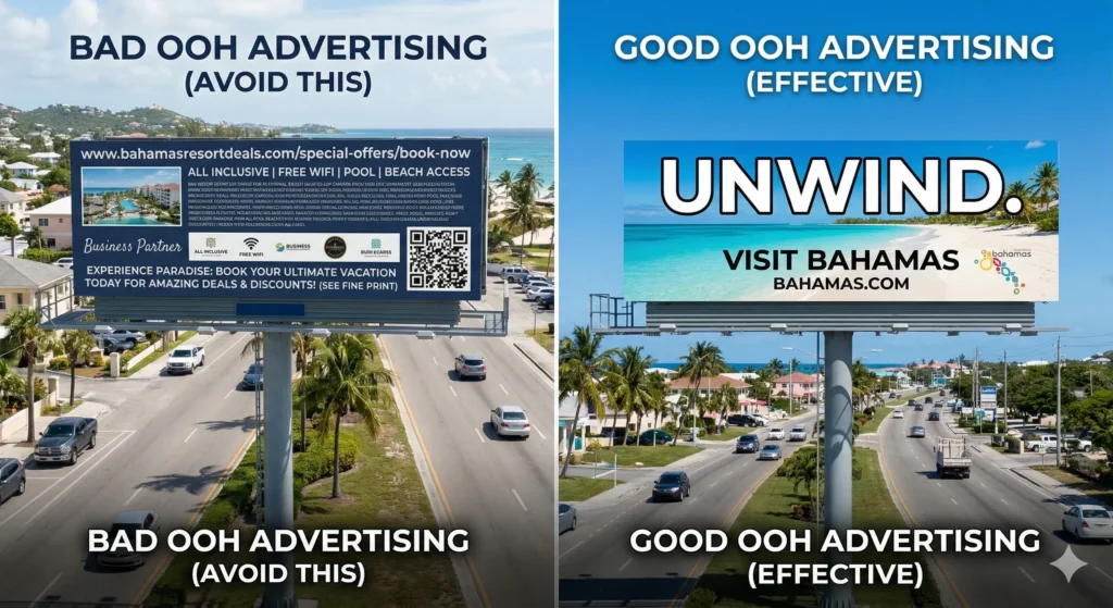
The reality is the exact opposite. In Out-of-Home (OOH) advertising, you aren’t buying space; you are buying seconds. Specifically, you are buying about six seconds of a driver’s cognitive load. When we clutter a sign with small text and multiple call-to-actions, we aren’t “educating” the consumer; we are becoming invisible to them.
The Golden Rule: Less is Enough
To master the medium, you must embrace the discipline of subtraction. If a consumer can’t digest your message at 50 mph, you haven’t bought an advertisement—you’ve bought expensive wallpaper.
1. The Power of Three (Visual Hierarchy)
The human brain, when moving, can only process approximately three visual elements before it stops trying. Your layout must follow a strict hierarchy:
- The Hook: One dominant image or one bold headline.
- The Brand: One clear, high-contrast logo.
- The Action: One simple takeaway (a URL or purely brand recognition).
Pro Tip: Adding a fourth element—like a “Follow us on Facebook” icon—statistically reduces the recall of the first three.
2. The 7-Word Ceiling
If your headline requires a comma, it’s too long. A billboard is a “glance medium.”
- The Goal: 5 to 7 words total.
- The Reality Check: You are competing with traffic, weather, and radio. Your copy shouldn’t be “read”; it should be recognized.
- The Fix: Instead of “Our New Branch is Now Open in Palmdale to Serve Your Banking Needs,” use “Now Open in Palmdale.” The logo tells them who you are; the copy tells them where.
3. Contrast is Your Only Friend
The Bahamas sun is unforgiving. High-key lighting washes out pastel colors and thin fonts.
- Typography: Use bold, heavy-weight Sans Serif fonts. Avoid scripts or “elegant” thin serifs—they disappear at a distance.
- Color Theory: Stick to high-contrast pairings. Black on yellow is the most legible combination from a distance.
- Kerning: Give your letters room to breathe. When letters are too close, they “blur” together for a driver 300 feet away.
4. Kill the QR Code
Unless the sign is at a bus stop, an airport lounge, or a checkout line where people are standing still, delete the QR code. A QR code on a highway billboard is a safety hazard and a design fail. If your digital strategy relies on a driver reaching for their phone at 50 mph, your strategy is broken.
5. The “Arm’s Length” Litmus Test
Before sending a file to the printer, pull it up on your smartphone. Hold it at arm’s length. Can you read every word and identify the brand in under five seconds? If you have to squint, your outdoor campaign is already dead on arrival.
A Call for Visual Discipline
We need to stop treating billboards like brochures and start treating them like landmarks. Effective OOH advertising signals corporate confidence. It tells the consumer, “We know exactly who we are and what we want to say to you.”
In a world screaming for attention, the quietest, cleanest sign is often the loudest one in the room. Give the viewer back their time, and they will finally give you their attention.
FAQ
What is the “6-second rule” in outdoor advertising? It is the principle that a viewer has only six seconds to process a billboard. To be effective, the design must be readable at a glance, typically featuring fewer than seven words.
Why are QR codes ineffective on highway billboards? QR codes require a stationary viewer and a steady hand. On a highway, they are a safety hazard and nearly impossible to scan, making them a wasted design element.
What is the ideal word count for an outdoor headline? The industry standard is 5 to 7 words. Exceeding this limit reduces legibility and prevents the message from being retained by passing motorists.
How does “Marketing Vertigo” affect brand perception? Marketing Vertigo occurs when a sign is cluttered with too many images and text. It signals corporate disorganization and confuses the consumer, leading to zero brand recall.
What typography is best for outdoor signage? High-contrast, bold Sans Serif fonts are ideal. They remain legible under the harsh glare of the sun and from great distances, unlike scripts or thin serif fonts.